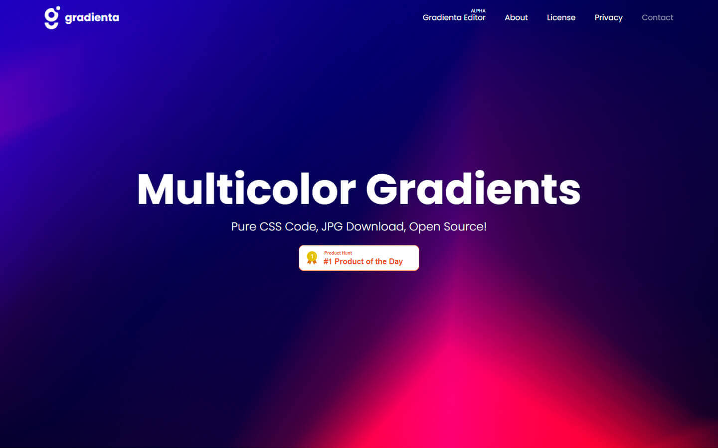
Gradientaは複雑なグラデーションのCSSコードをコピーしたり、JPGで保存できるWebサービスです。
海外のデザイナーさんが作られたサイトで現在、150種類以上のグラデーションがアーカイブされています。
今回はGradientaの使い方から実際に作ったサンプルを紹介していきます。
Gradientaの使い方
Gradientaの使い方はとても簡単です。
CSSを読み込む必要がないので使いたいグラデーションを選択しコピーすれば簡単に使えます。
まずはGradienta にアクセスしてみましょう。
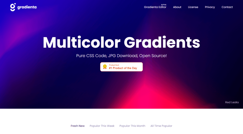
スクロールしていくと様々なグラデーションのパターンが表示されます。

上部にあるタブから条件を選ぶこともできます。
- Fresh New – 新着順
- Popular This Week- 人気順(今週)
- Popular This Month- 人気順(今月)
- All Time Popular- 人気順(全ての期間)
気に入ったグラデーションが見つかったらカーソルを合わせてください。

左の「CSS」をクリックするとCSSのコードがコピーできます。
右の「View」をクリックするとプレビューのページへいきます。
※このプレビューのページから画像もダウンロードできます。

プレビューページで実際の使用イメージが確認できます。
「Download JPG」をクリックすると画像がダウンロードできます。
また「Copy CSS」をクリックするとCSSのコードがコピーされます。
別途CSS読み込む必要がないので使い方はとても簡単です!
サンプル①
サンプル①で使用したのは「Urban Health 」です。

サンプルページ

ソースコード
HTML
<div class="main">
  <div class="main-visual">
    <h1 class="main-visual-title">Gradienta<br>Sample code</h1>
  </div>
  <h2 class="square-title">Gradienta Sample code</h2>
  <h2 class="circle-title">Gradienta Sample code</h2>
  <a href="" class="button">BACK</a>
</div>
CSS
.main {
  padding-bottom: 10vh;
}

.main-visual {
  width: 100%;
  height: 80vh;
  display: flex;
  -webkit-align-items: center;
          align-items: center;
  -webkit-justify-content: center;
          justify-content: center;
  background: linear-gradient(140.54deg, #608D00 0%, #D30000 72.37%), linear-gradient(360deg, #0029FF 0%, #8FFF00 100%), radial-gradient(100% 164.72% at 100% 100%, #6100FF 0%, #00FF57 100%), radial-gradient(100% 148.07% at 0% 0%, #FFF500 0%, #51D500 100%);
  background-blend-mode: color-dodge, overlay, difference, normal;
}

.main-visual-title {
  font-size: 7vw;
  color: #FFF;
  text-shadow: 0 2px 4px rgb(13 0 77 / 8%), 0 3px 6px rgb(13 0 77 / 8%), 0 8px 16px rgb(13 0 77 / 8%);
}

.square-title {
  font-size: 4vw;
  position: relative;
  margin: 10%;
}

.square-title::before {
  content: '';
  display: block;
  width: 12vw;
  height: 12vw;
  position: absolute;
  left: -5vw;
  bottom: -1vw;
  z-index: -1;
  background: linear-gradient(140.54deg, #608D00 0%, #D30000 72.37%), linear-gradient(360deg, #0029FF 0%, #8FFF00 100%), radial-gradient(100% 164.72% at 100% 100%, #6100FF 0%, #00FF57 100%), radial-gradient(100% 148.07% at 0% 0%, #FFF500 0%, #51D500 100%);
  background-blend-mode: color-dodge, overlay, difference, normal;
}

.circle-title {
  font-size: 4vw;
  position: relative;
  margin: 10%;
}

.circle-title::before {
  content: '';
  display: block;
  width: 12vw;
  height: 12vw;
  -webkit-border-radius: 12vw;
          border-radius: 12vw;
  position: absolute;
  left: -5vw;
  bottom: -1vw;
  z-index: -1;
  background: linear-gradient(140.54deg, #608D00 0%, #D30000 72.37%), linear-gradient(360deg, #0029FF 0%, #8FFF00 100%), radial-gradient(100% 164.72% at 100% 100%, #6100FF 0%, #00FF57 100%), radial-gradient(100% 148.07% at 0% 0%, #FFF500 0%, #51D500 100%);
  background-blend-mode: color-dodge, overlay, difference, normal;
}

.button {
  margin: auto;
  display: block;
  width: 90%;
  max-width: 300px;
  font-size: 3vw;
  padding: .5em;
  text-align: center;
  -webkit-border-radius: 5px;
          border-radius: 5px;
  background: linear-gradient(140.54deg, #608D00 0%, #D30000 72.37%), linear-gradient(360deg, #0029FF 0%, #8FFF00 100%), radial-gradient(100% 164.72% at 100% 100%, #6100FF 0%, #00FF57 100%), radial-gradient(100% 148.07% at 0% 0%, #FFF500 0%, #51D500 100%);
  background-blend-mode: color-dodge, overlay, difference, normal;
}
サンプル②
サンプル②で使用したのは「Distorted Sun 」です。

サンプルページ

ソースコード
HTML
<div class="main">
  <div class="main-visual">
    <h1 class="main-visual-title">Gradienta<br>Sample code</h1>
  </div>
  <h2 class="square-title">Gradienta Sample code</h2>
  <h2 class="circle-title">Gradienta Sample code</h2>
  <a href="" class="button">BACK</a>
</div>
CSS
.main {
  padding-bottom: 10vh;
}

.main-visual {
  width: 100%;
  height: 80vh;
  display: flex;
  -webkit-align-items: center;
          align-items: center;
  -webkit-justify-content: center;
          justify-content: center;
  background: linear-gradient(115.58deg, #00FC19 0%, #1700A4 100.22%), radial-gradient(92.72% 100% at 50% 0%, #EBFFCB 0%, #651200 100%), radial-gradient(92.72% 100% at 50% 0%, #FAFF00 0%, #820000 100%), radial-gradient(109.21% 213.32% at 100% 0%, #FF4D00 0%, #00C2FF 100%), linear-gradient(127.43deg, #D50000 0%, #7856FF 100%);
  background-blend-mode: lighten, overlay, lighten, screen, normal;
}

.main-visual-title {
  font-size: 7vw;
}

.square-title {
  font-size: 4vw;
  position: relative;
  margin: 10%;
}

.square-title::before {
  content: '';
  display: block;
  width: 12vw;
  height: 12vw;
  position: absolute;
  left: -5vw;
  bottom: -1vw;
  z-index: -1;
  background: linear-gradient(115.58deg, #00FC19 0%, #1700A4 100.22%), radial-gradient(92.72% 100% at 50% 0%, #EBFFCB 0%, #651200 100%), radial-gradient(92.72% 100% at 50% 0%, #FAFF00 0%, #820000 100%), radial-gradient(109.21% 213.32% at 100% 0%, #FF4D00 0%, #00C2FF 100%), linear-gradient(127.43deg, #D50000 0%, #7856FF 100%);
  background-blend-mode: lighten, overlay, lighten, screen, normal;
}

.circle-title {
  font-size: 4vw;
  position: relative;
  margin: 10%;
}

.circle-title::before {
  content: '';
  display: block;
  width: 12vw;
  height: 12vw;
  -webkit-border-radius: 12vw;
          border-radius: 12vw;
  position: absolute;
  left: -5vw;
  bottom: -1vw;
  z-index: -1;
  background: linear-gradient(115.58deg, #00FC19 0%, #1700A4 100.22%), radial-gradient(92.72% 100% at 50% 0%, #EBFFCB 0%, #651200 100%), radial-gradient(92.72% 100% at 50% 0%, #FAFF00 0%, #820000 100%), radial-gradient(109.21% 213.32% at 100% 0%, #FF4D00 0%, #00C2FF 100%), linear-gradient(127.43deg, #D50000 0%, #7856FF 100%);
  background-blend-mode: lighten, overlay, lighten, screen, normal;
}

.button {
  margin: auto;
  display: block;
  width: 90%;
  max-width: 300px;
  font-size: 3vw;
  padding: .5em;
  text-align: center;
  -webkit-border-radius: 5px;
          border-radius: 5px;
  background: linear-gradient(115.58deg, #00FC19 0%, #1700A4 100.22%), radial-gradient(92.72% 100% at 50% 0%, #EBFFCB 0%, #651200 100%), radial-gradient(92.72% 100% at 50% 0%, #FAFF00 0%, #820000 100%), radial-gradient(109.21% 213.32% at 100% 0%, #FF4D00 0%, #00C2FF 100%), linear-gradient(127.43deg, #D50000 0%, #7856FF 100%);
  background-blend-mode: lighten, overlay, lighten, screen, normal;
}
サンプル③
サンプル③で使用したのは「Undefined Ways 」です。

サンプルページ

ソースコード
HTML
<div class="main">
  <div class="main-visual">
    <h1 class="main-visual-title">Gradienta<br>Sample code</h1>
  </div>
  <h2 class="square-title">Gradienta Sample code</h2>
  <h2 class="circle-title">Gradienta Sample code</h2>
  <a href="" class="button">BACK</a>
</div>
CSS
.main {
  padding-bottom: 10vh;
}

.main-visual {
  width: 100%;
  height: 80vh;
  display: flex;
  -webkit-align-items: center;
          align-items: center;
  -webkit-justify-content: center;
          justify-content: center;
  background: linear-gradient(301.28deg, #00C2FF 54.38%, rgba(0, 255, 224, 0) 100%), linear-gradient(129.96deg, #FF2F2F 10.43%, #000460 92.78%), radial-gradient(100% 246.94% at 100% 0%, #8000FF 0%, #BA75FF 54.17%, #FF0000 100%), linear-gradient(58.72deg, #2200F2 0%, #530000 100%), linear-gradient(154.03deg, #FF0000 0%, #00FF94 74.04%), linear-gradient(301.27deg, #FF0000 0%, #0038FF 84.63%), linear-gradient(136.23deg, #00C2FF 11.12%, #FF0000 86.47%), radial-gradient(57.37% 100% at 50% 0%, #B50000 0%, #0034BB 100%);
  background-blend-mode: multiply, overlay, color-burn, screen, difference, difference, difference, normal;
}

.main-visual-title {
  font-size: 7vw;
  color: #FFF;
  text-shadow: 0 2px 4px rgb(13 0 77 / 8%), 0 3px 6px rgb(13 0 77 / 8%), 0 8px 16px rgb(13 0 77 / 8%);
}

.square-title {
  font-size: 4vw;
  position: relative;
  margin: 10%;
}

.square-title::before {
  content: '';
  display: block;
  width: 12vw;
  height: 12vw;
  position: absolute;
  left: -5vw;
  bottom: -1vw;
  z-index: -1;
  background: linear-gradient(301.28deg, #00C2FF 54.38%, rgba(0, 255, 224, 0) 100%), linear-gradient(129.96deg, #FF2F2F 10.43%, #000460 92.78%), radial-gradient(100% 246.94% at 100% 0%, #8000FF 0%, #BA75FF 54.17%, #FF0000 100%), linear-gradient(58.72deg, #2200F2 0%, #530000 100%), linear-gradient(154.03deg, #FF0000 0%, #00FF94 74.04%), linear-gradient(301.27deg, #FF0000 0%, #0038FF 84.63%), linear-gradient(136.23deg, #00C2FF 11.12%, #FF0000 86.47%), radial-gradient(57.37% 100% at 50% 0%, #B50000 0%, #0034BB 100%);
background-blend-mode: multiply, overlay, color-burn, screen, difference, difference, difference, normal;
}

.circle-title {
  font-size: 4vw;
  position: relative;
  margin: 10%;
}

.circle-title::before {
  content: '';
  display: block;
  width: 12vw;
  height: 12vw;
  -webkit-border-radius: 12vw;
          border-radius: 12vw;
  position: absolute;
  left: -5vw;
  bottom: -1vw;
  z-index: -1;
  background: linear-gradient(301.28deg, #00C2FF 54.38%, rgba(0, 255, 224, 0) 100%), linear-gradient(129.96deg, #FF2F2F 10.43%, #000460 92.78%), radial-gradient(100% 246.94% at 100% 0%, #8000FF 0%, #BA75FF 54.17%, #FF0000 100%), linear-gradient(58.72deg, #2200F2 0%, #530000 100%), linear-gradient(154.03deg, #FF0000 0%, #00FF94 74.04%), linear-gradient(301.27deg, #FF0000 0%, #0038FF 84.63%), linear-gradient(136.23deg, #00C2FF 11.12%, #FF0000 86.47%), radial-gradient(57.37% 100% at 50% 0%, #B50000 0%, #0034BB 100%);
  background-blend-mode: multiply, overlay, color-burn, screen, difference, difference, difference, normal;
}

.button {
  margin: auto;
  display: block;
  width: 90%;
  max-width: 300px;
  font-size: 3vw;
  padding: .5em;
  text-align: center;
  -webkit-border-radius: 5px;
          border-radius: 5px;
  background: linear-gradient(301.28deg, #00C2FF 54.38%, rgba(0, 255, 224, 0) 100%), linear-gradient(129.96deg, #FF2F2F 10.43%, #000460 92.78%), radial-gradient(100% 246.94% at 100% 0%, #8000FF 0%, #BA75FF 54.17%, #FF0000 100%), linear-gradient(58.72deg, #2200F2 0%, #530000 100%), linear-gradient(154.03deg, #FF0000 0%, #00FF94 74.04%), linear-gradient(301.27deg, #FF0000 0%, #0038FF 84.63%), linear-gradient(136.23deg, #00C2FF 11.12%, #FF0000 86.47%), radial-gradient(57.37% 100% at 50% 0%, #B50000 0%, #0034BB 100%);
  background-blend-mode: multiply, overlay, color-burn, screen, difference, difference, difference, normal;
}
まとめ
さて、いかがだったでしょうか?
今回紹介したGradientaを使用するとオシャレなグラデーションを簡単に実装できます。
またCSSの勉強にもなるのでコードを分析してカスタマイズしてみましょう!